We always overestimate the change that will occur in the next two years and underestimate the change that will occur in the next ten. Don't let yourself be lulled into inaction. - Bill Gates
I left my house in 2010 to go and pursue Engineering. I used to live in a 1-bedroom apartment with 4 other roommates. Having lived at home until then, one of my biggest worries was getting adjusted to a life where there is no TV. You see, we did not have a TV, 3 out of 5 roommates did not even have a laptop. But I soon got adjusted to not watching TV and in my second year, I got the “family” laptop (Surprisingly, it still works now in 2020).
A by-product of breaking that habit of watching the TV was not following the news cycle. Because of that, I have not “seen” TV news in almost 10 years. These days, if you follow the news cycle, especially TV news, you will feel as if the world is about to end and everything bad that is happening in the world is happening right outside your door.
However, that could not have been further from the truth. Objectively, if you look at the world, we have improved significantly.
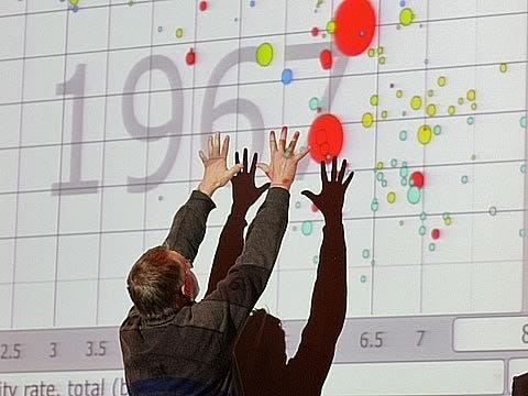
Hans Rosling was a Professor of International Health at Karolinska Institute. He also co-founded Gapminder Foundation. The foundation aims to fight the ignorance about the progress we have made in the world by objectively looking at the data. Hans Rosling presents some of their findings in the below TED talk. I highly recommend watching it.
Plotting the data in R
I decided to plot such a graph and animate it in R. In addition to ggplot2, R also has the gganimate package, which provides a way for us to put some “life” into the graphs that we plot and animate them.
Ther is an R package called “gapminder” which provides a convenient way to install and work on the data. I also used packages “tidyverse” (cleaning up the data), “hrbrthemes” (look and feel of the graphs) and “gganimate” (animating the graphs)
The graph plots GDP Per Capita on the x-axis and Life Expectancy on the y-axis. The size of the bubble is proportional to the population of the country. The gapminder package also provides a colour vector “country_colors” to be used for all the countries. Plotting the graph and animating it throughout the years will give us below output -
Full code for this can be accessed here.

Important Observation
This takes me back to the quote at the beginning of this post.
We see incredible progress in the Life Expectancy of people all over the world. We see that in many countries as life expectancy increases the GDP per capita also increases. We see that millions of people all over the world are coming out of poverty and at the same time have increased their lifespan.
So when next time someone says the world is awful, tell them -
The world is much better, the world is awful, the world can be much better.


